01Homepage
www.kolomedia.eu
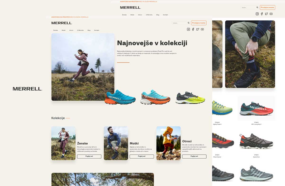

E-commerce
We organised a large catalogue so customers can find the right product quickly and continue shopping without unnecessary steps, including on mobile.
Project overview
Merrell offers a wide range of footwear and clothing, so customers need a clear overview from the moment they arrive. We structured the store around understandable categories, faster product discovery and useful information that supports each decision. The brand remains recognisable throughout, while the catalogue feels easier to explore. Mobile use received particular attention. Browsing the range, opening product pages and moving towards a purchase remain straightforward on a smaller screen. The same logic carries across tablet and desktop, so customers do not have to relearn the store when they switch devices. The result is an online store where catalogue size does not become a burden. Customers can reach a suitable product with less effort, while Merrell Slovenia has an organised foundation for presenting its range and developing online sales further.
02 / The complete experience
Explore the homepage and two key inner pages. Each preview slowly scrolls through the complete page.
WHY THIS STRUCTURE WORKS
The homepage quickly introduces the brand, organises the offer and guides visitors towards the most relevant service or next step.
A key inner page explains the service in greater depth, answers important questions and builds confidence before an enquiry.
Focused content demonstrates expertise, supports search visibility and creates additional entry points for future customers.
The homepage provides a quick introduction to the brand and its range, while inner pages lead customers towards the details they need to choose. Categories, products and content paths follow the same logic, keeping a large catalogue predictable to browse. On mobile, the layout adapts without hiding essential information or making the next step harder to reach. The store therefore remains easy to understand from initial discovery through to continuing the purchase.
CASE STUDY
The broad footwear and clothing range had to remain easy to understand, particularly for customers browsing many options on a mobile screen.
We connected categories, product presentation and the path to purchase within one consistent system. Each screen presents the essential information and a clear next step.
The range is easier to understand and finding a suitable product takes less effort. The store now has an organised foundation for continued e-commerce growth.
Have a similar challenge?
Tell us what you want to improve, build or launch.
Start a conversation↗