01Homepage
artisana.si
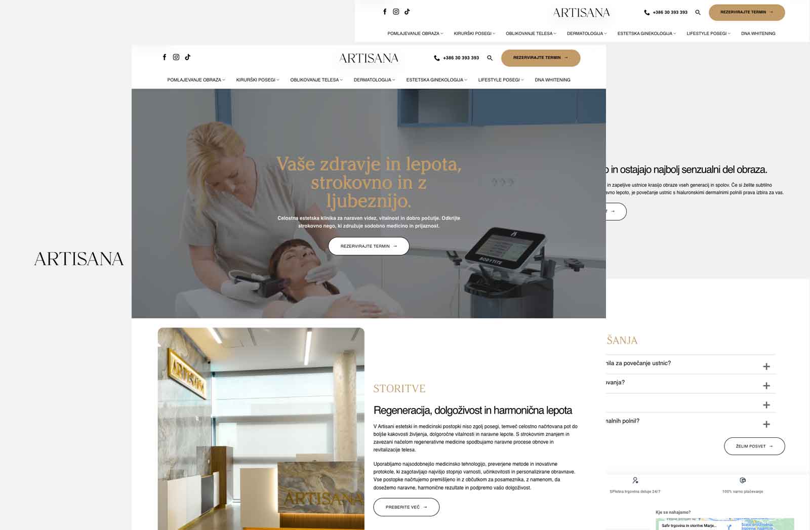

Website
We brought a varied range of specialist services into a calm, well-structured website where visitors can understand the offer and find details easily.
Project overview
Artisana offers a varied range of specialist services, and visitors need to understand what is relevant to them without searching for too long. We began by organising the content and defining a clear relationship between the main introduction, individual services and the information that supports the next step. The visual language is calm and restrained. Specialist content, photography and straightforward navigation remain in focus, without unnecessary elements competing for attention. Each inner page has a distinct purpose while following the same presentation rules and contributing to one coherent story. The website adapts naturally across mobile, tablet and desktop. Text remains comfortable to read and important links are easy to reach. Artisana now has a website that explains its offer in an orderly way and builds confidence at a measured pace. Visitors can gain an initial understanding first, then explore the details that matter to them.
02 / The complete experience
Explore the homepage and two key inner pages. Each preview slowly scrolls through the complete page.
WHY THIS STRUCTURE WORKS
The homepage quickly introduces the brand, organises the offer and guides visitors towards the most relevant service or next step.
A key inner page explains the service in greater depth, answers important questions and builds confidence before an enquiry.
Focused content demonstrates expertise, supports search visibility and creates additional entry points for future customers.
The homepage introduces Artisana’s character and opens clear paths to individual services. Inner pages slow the experience down, giving visitors room to read, understand and decide what to do next. Consistent typography, measured spacing and familiar navigation bring the extensive offer together. On smaller screens, text remains readable and important information stays within easy reach, allowing the website to work reliably however it is visited.
CASE STUDY
The varied specialist services needed a clear presentation that would not make the website feel crowded or overwhelm visitors with information.
We divided the content into clear sections and supported it with a calm visual language and consistent navigation. Visitors can explore the offer one step at a time.
Artisana now has an organised website that makes specialist content more approachable and helps visitors reach the information they need.
Have a similar challenge?
Tell us what you want to improve, build or launch.
Start a conversation↗